
zito panettoncino
A small packaging for the small brother of the typical panettone
Zito is an Italian panettone brand that focuses on the smallest version of the Christmas sweet: the panettoncino. With its premium yet playful branding, it aims to blend exotic flavours and a traditional sweet for an all year round consumption.
Fields
Packaging
Branding
Art direction
YEAR
2025
Zito is a new brand of panettones with a clear purpose: to bring the unique and comforting flavor of panettone, infused with the values and aromas of Christmas, to any time of the year. Its specialty is the panettoncino, a mini version of this classic treat, offering a unique concept: a special edition tailored to each season. No matter the month on the calendar, with Zito, you'll always have a small, delicious, high-quality delight to share with your loved ones.


Results
Life's too short to only eat panettone once a year
I designed the whole brand and concept from scratch, the packaging (which was a challenge, since the die-cut is pretty irregular) and the art direction of the photography.




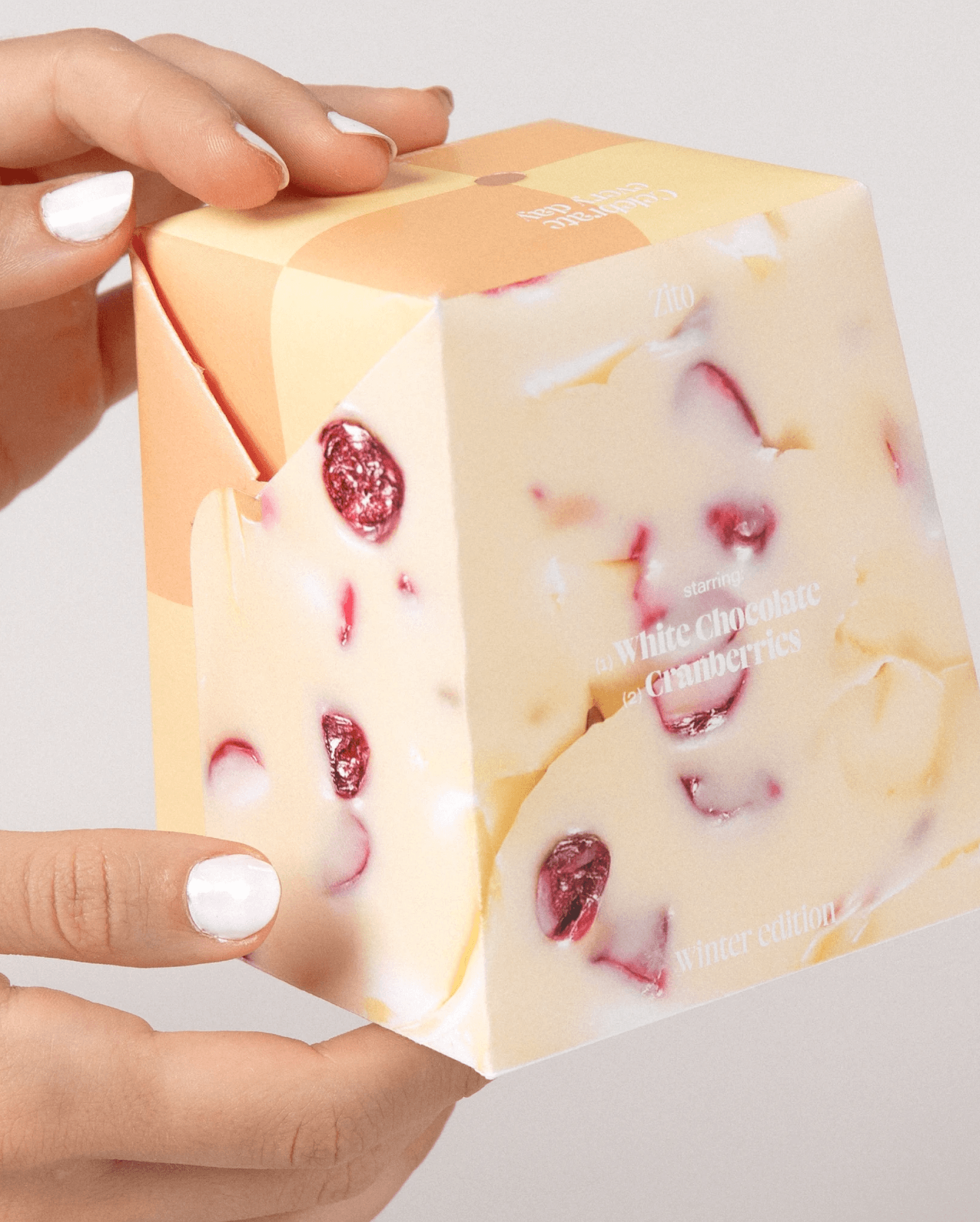


This project was a mini assignment that I took a little overboard. Because 1. A single packaging without a series was too boring and 2. it was the first (and last) time that we were allowed to use the laser cutting machine at university.
So, I developed the full product world instead of just one box. And that allowed me to think of new flavours, of color combinations and use typography in a clean and recognizable way. I thought of a brand that I would genuinely buy. It is then a good example of trying to think outside of the brief and expanding the universe if necessary.
If I were to do it now, I would try to find a good glue, since some of the slopes kept detaching themselves, and a proper paper, since I went a little overboard with the gramage. Additionally, I would like to explore AI for the generation of images and mockups so as to elevate the art direction.
