a pasta brand
Italy's Bari inspired pasta packaging
Vicoli is a pasta brand that embodies the culinary traditions of Bari, Italy. It aims to breath both tradition and modernity, as well as young adults to the culinary act of cooking and sharing a meal together
Fields
Branding
Logotype
Art Direction
Packaging
YEAR
2024
TEAM
Elena Rabadán
Beatriz Lisso
Irene Losada
ROLE
Type design, art direction, branding, logotype and packaging design
The brand's name is inspired by the concept of the vicoli, or narrow streets. Walking through these streets allows you to discover their history and traditions, including the artisanal production of pasta.
The streets also play a significant role visually, with the signs of local businesses and their characteristic bustle reflected in the packaging.


A typeface born from the streets
VicoliSans is a custom-made display typeface inspired by the street signs of Bari and contemporary typographic design. It also takes some elements of Italian typefaces of the 19th and 20th century and mixes them with a clean and well structured design that conveys it a fresh air.


results
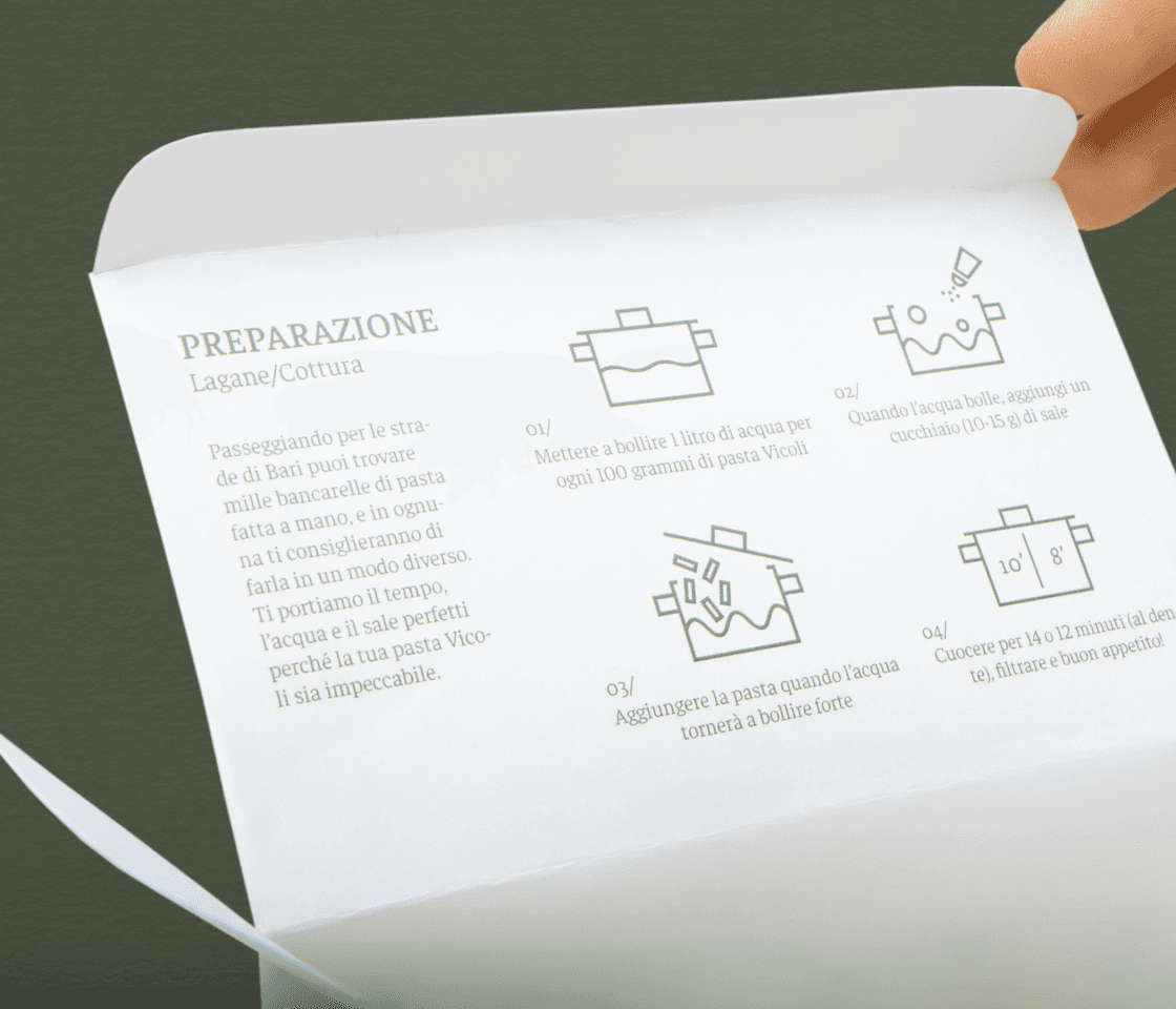
The packaging boxes are aimed to represent the variety of houses in a traditional street, and together with the typeface, the transparent window and the drawing of the canopy, help represent that.
In the laterals, we can find illustrations of people enjoying life in the streets with their beloveds. In the end, this is a pasta to share, so we designed each variety to advocate for it. Verbs like: being present, cooking, laughing or remembering help to understand the concept.
The art direction lets the viewer think of a whimsical paradise, an eternal Sunday lunch with your beloved ones. A huge dish of pasta cooked with care. A happily ever after Mediterranean lifestyle.


The brand also grows and can be applied to other type of products, such as this first launch of pasta sauces to enjoy on the go.




Summer houses, making typefaces and other adventures
Even though the visual results of this project are satisfactory and polished, the roads we had to walk to reach them were not.
The concept and idea came to mind easily, but things like making a typeface from scratch were problems we encountered along the way. Nothing fitted the vision we had in mind, and my interest in sketching letters brought me to say: why not?
VicoliSans is only living in an illustrator file, and the kerning is manually adjusted in pairs. Very DIY. I would use Glyphs now, if only to make something functional and not relaying in the designer's (me) every time a new word is needed.
Being based in Bari meant we NEEDED Orechietti as a pasta variety, so we went several trips to specialized pasta shops to get them (and once got them robbed :,) We also did a big trip in public transport to reach Elena's summer house, for its garden, all loaded with ceramic dishes, special jars and our fragile, handmade pasteboxes. I will never understimate the value of production after this.
I think the project lacks a good product photography in a studio. We had a session, but the results were not good, so we tried to fix it with a 3D render, but it lacks the humanity of the other images.
All those things considered, the results are still very satisfactory to watch. And I bet you could not tell we used gluten free pasta 👀

How some of the pictures were taken
