La casa de los aromas illustrated packaging
A packaging that speaks of smells
Illustrated packaging for a Spanish brand that sells mikados, candles and specializes in premium aromas for houses
Fields
Illustration
Packaging
YEAR
2025
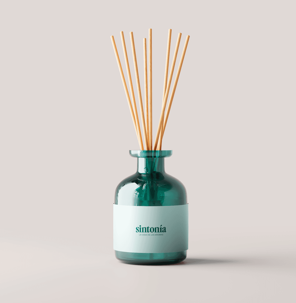
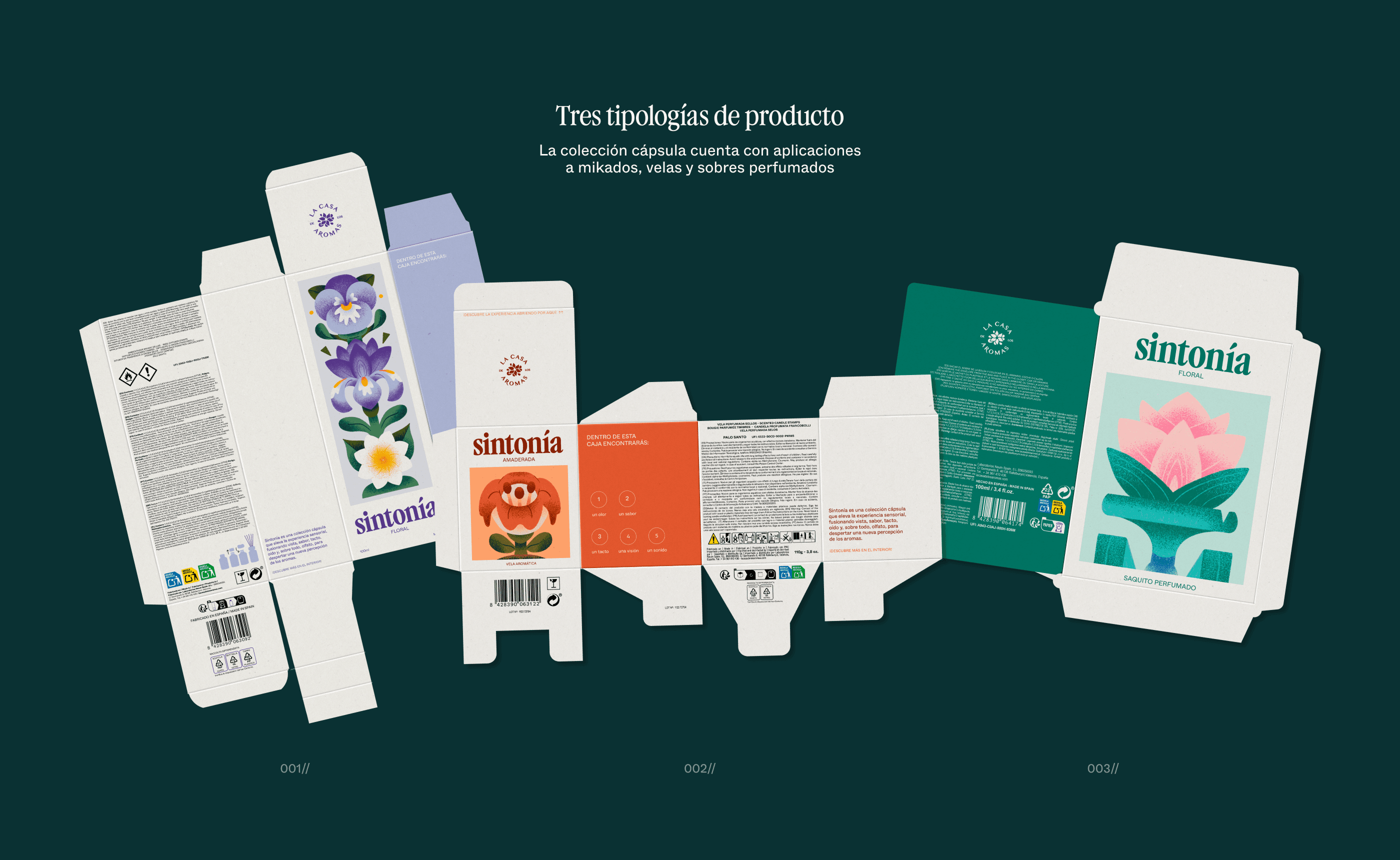
La Casa de los Aromas (House of Scents in Spanish) is a popular Spanish brand specializing in the manufacture and sale of home fragrance and wellness products. As part of an assignment, we proposed a set of illustrations for different products based on three smells: floral, woody and aquatic.

Floral notes and grainy illustrations
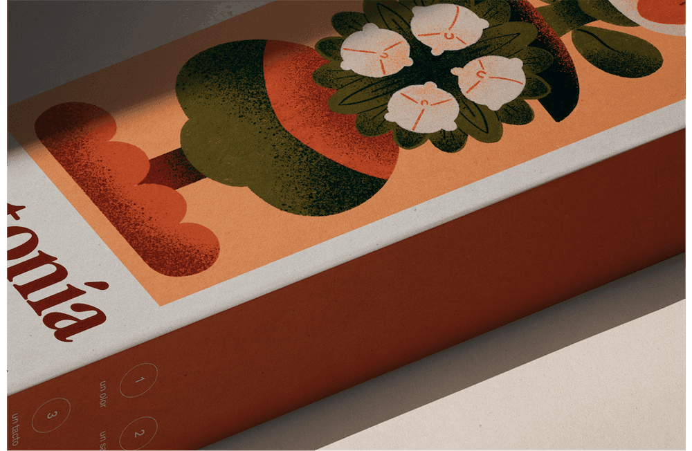
Since the briefing gave almost full creative freedom, I decided to base the illustrations on the shape of the main packaging. Scents have top, heart and base notes, so based on this hierarchy, I created three tandems with those notes in a vertical design.
The concept behind the packaging is based on synesthesia, the phenomenon in which the senses interconnect and a stimulus activates a response in another sense.
To reinforce this, inside of the packaging there is a recipe, a bookmark to be seen when reading and a song. The touch is reinforced by the rough texture of the box itself.



The first idea for this project had nothing to do with what you have just seen. It was based on mediterranean tiles. But I encountered many problems along the way and tried to experiment a little too much in a very short period of time. Those trials were indeed horrendous.
So, what I am taking from this project is that, if you are not feeling the idea, maybe it is not there. Maybe option B was also a good one. And not only did it give me a much better and cohesive result, but it then got featured in Behance twice.
I used to illustrate a lot before going full into graphic and digital design. So it always feels nice to go back to my origins, to spend time sketching and trying colors, using textures and reminding myself that drawing can be a powerful tool in design!
These are some of those first trials 👇