Global project
Branding and digital product design for a conscious audio speaker brand
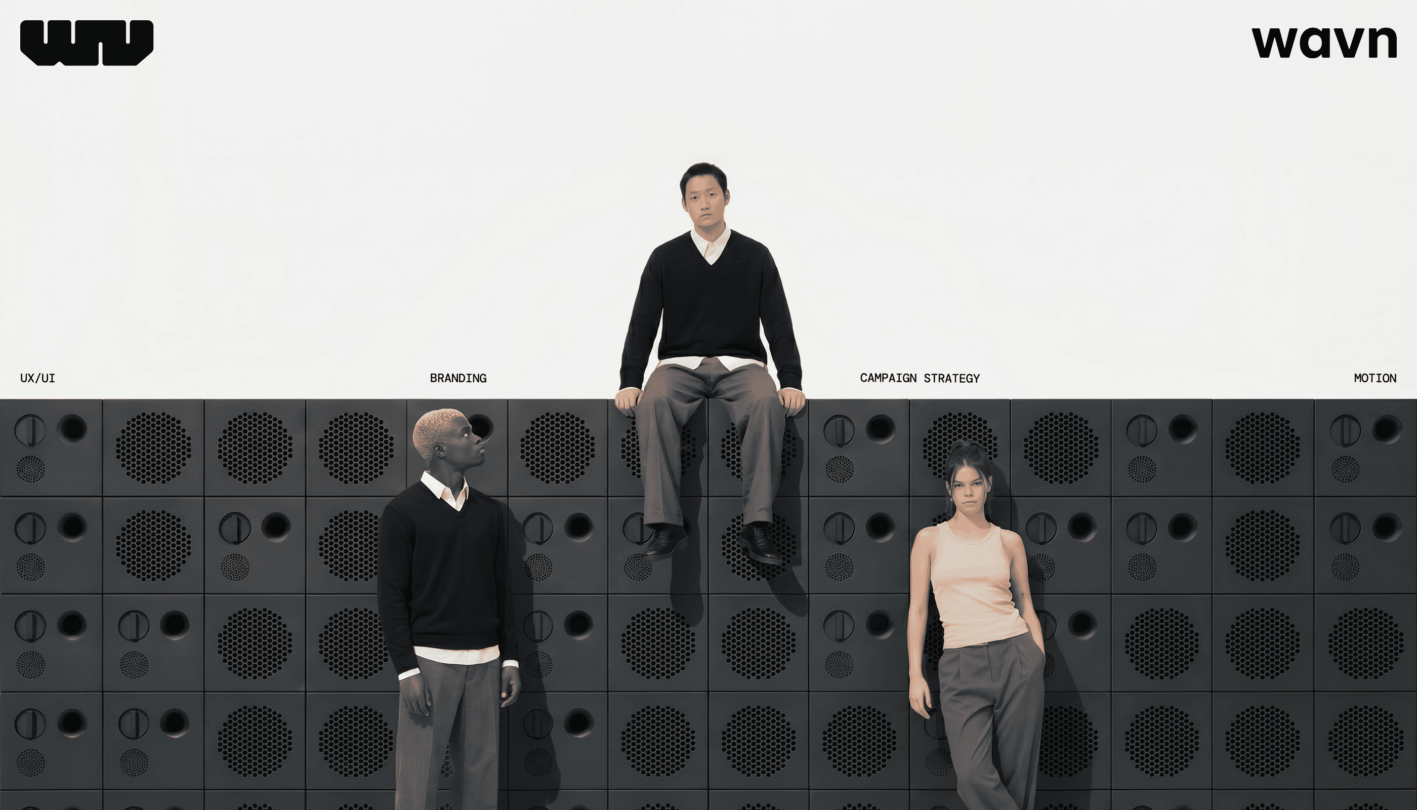
Wavn is a modular speaker brand focused on timeless, durable design. Its entry product is a compact module that delivers a clear, crisp sound, built with sustainable materials and fully reparable parts. From there, the system grows: different modules can be added to tailor the experience to each user.
Fields
Brand Design
Product Design
Campaign & Activation
Motion graphics
YEAR
2026
TEAM
Carmen Herrero
Luis Majadero
Yolanda Vera
ROLE
Brand design, motion design, UX and UI of the website, microinteractions, AI image generation
brand reel
The project in a nutshell
Such as every big brand nowadays, we compiled all the project into a short video. Turn on the sound for a better experience!
the challenge
Standing up in a well-stablished market
Audio is a market ruled by specs. wavn entered with no legacy and no interest in that conversation. The positioning was built around modularity as a philosophy: buy what you need, expand when you're ready, replace if it ever breaks. Sustainability not as a message, but as a consequence of good design.
Wavn doesn't claim to be conscious. it's just built that way.

The brand claim, choose what you listen to, refers to both making a conscious choice by buying the speaker and to listening to actual social and environmental issues. It elaborates on the dilemma of whether a tree falling in the forest makes sound when there is nobody to listen to it.

The solution
A 360º refined approach to communication and contact points

product design
A website that feels like a experience thanks to scrollytelling
We used scrollytelling as the way to explain to potential buyers how the system actually works. By interacting with the website, they understand clearly how modules built on top of each other and how to customize the final result to your own liking.
The website is also filled with microinteractions and a huge attention to detail: product cards, led animations, hovers, buttons or even product explosions that show how to actually replace a broken part.

brand and campaign
A brand that breathes timeless. A campaign that makes noise in the middle of the forest.
The brand is inspired by the timeless design of Dieter Ramms and the functionalist design of the 50s and 60s. The grid layouts, the line drawings and the huge amoung of white space are combined with the boldness of a logo that was geometrically composed and illustrates the first and last letter of the name.
The campaign, both in print and digital, is designed to capture the attention of the public with large, cinematic posters. As if they were a movie series with multiple parts, each poster and video represents an environmental problem with the speaker in a surrealistic atmosphere. A call to action related to nature and a way to say we are conscious without using green per se.
All the images were generated with AI using Krea and Google Flow. A very interesting practice on generative tools, although the amount of time spent on nailing down our vision was quite large.


Learnings
A 360 project requires a 360 vision
This is one of the most complete projects I have done so far. Working on every single touchpoint, meaning that everything designed was covered by us the team, was both very enriching and very tiring at the same time.
All the team members were working full time, so the amount of time and energy we could dedicate to the project was not always our best. However, we are incredibly happy with how it turned out. From the motion to the attention to detail, our tiredness does not show on the final results
I think part of the reason is that we spent a lot of time going back and forth to what we had previously designed. Iteration is very draining, but always gives the best results. And we kept that going until the last minute
On a personal level, I took the most out of the motion part, where, next to Luis, I experimented and improved a lot for the reel or the microinteractions. Also, stepping out of the box/frame and thinking in scrollytelling terms was a very nice exercise that I feel now I apply to all website projects in front of me. The image generation / art direction practice was also good, although not as easy nor as fast as expected.
Had we had more time? Sure, we'd have polished more the reel. Maybe showcase and prototype the full lenght of the website. Or even vibe-coded it to really show our vision to the development team. There are many ways to improve handovers that were not accounted for this academic project.
Any questions? Drop me a word in an email or send me DM! Love discussing design
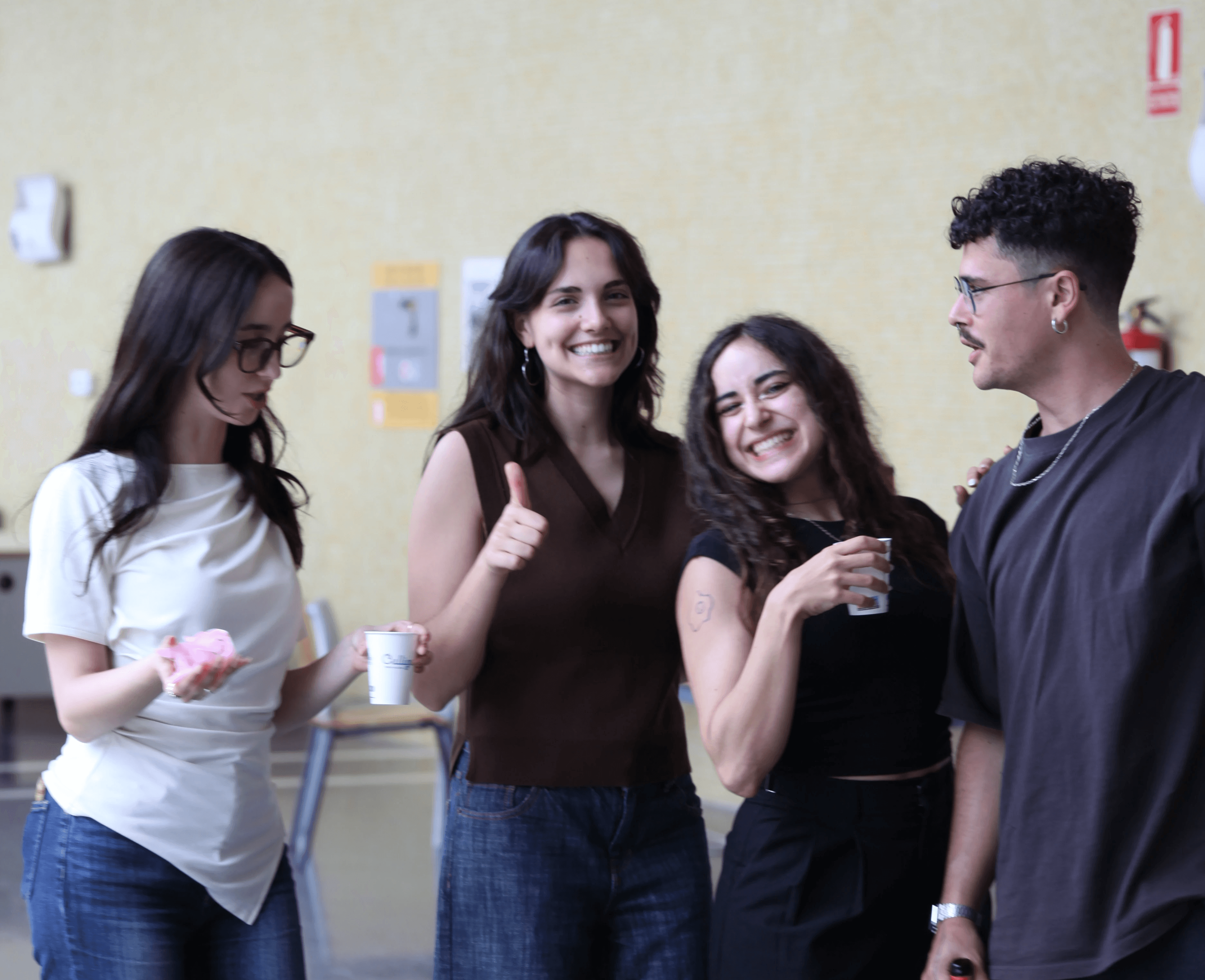
Luis, Carmen, Yoli and I the day we finished wavn!