university TEAM PROJECT
An AI-powered family assistant to aid with the care of elderly and children
Niva is an assistant that helps you manage the tasks and responsibilities of your home, so their distribution is more balanced and all the members of the family can achieve a state of wellbeing by resting more.
Fields
UX Research
UX Design
Interface Design
Brand Design
YEAR
2026
TEAM
Luca Gio
Aina Sanz
Isla Pearce
ROLE
Research, user experience, user interface, brand definition and motion +
Middle-aged parents: the sandwich generation and a big lack of rest
Under the premise of building a Health-Tech focused MVP as part of our MA, our team landed on a topic of social, political, and personal interest: the aging population pyramid and the importance of rest.
The sandwich generation is a growing problem in many countries: having children later down in life leaves already precarious parents in charge of newborns and their own parents alike. The lack of money and time ends up in an endless cycle of burnout.
Caring for others is often a full-time, unpaid job. Free time is taken up by others' necessities or wishes. No time for leisure nor rest.
Is it a lack of organization? An inability to delegate? A social structure that fails to support these situations? Gender roles? We set out to find out what was at the root of the problem and to ideate ways to solve it.
Or, at least, to improve the situation. We encountered a much bigger problem than we initially thought. Systemic imbalances are hard to solve with an app. But we did our best.
Those hypotheses needed validation before we started ideating solutions. So, after those initial desk research findings, we set out to define and validate the problem statement.
We conducted and analyzed 7 user interviews (in just a week notice). We then gathered the insights that served to confirm and refine our initial hypothesis.


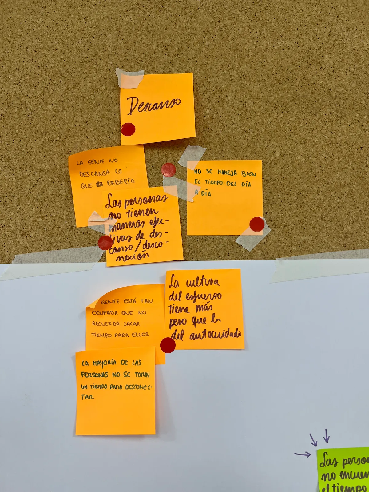
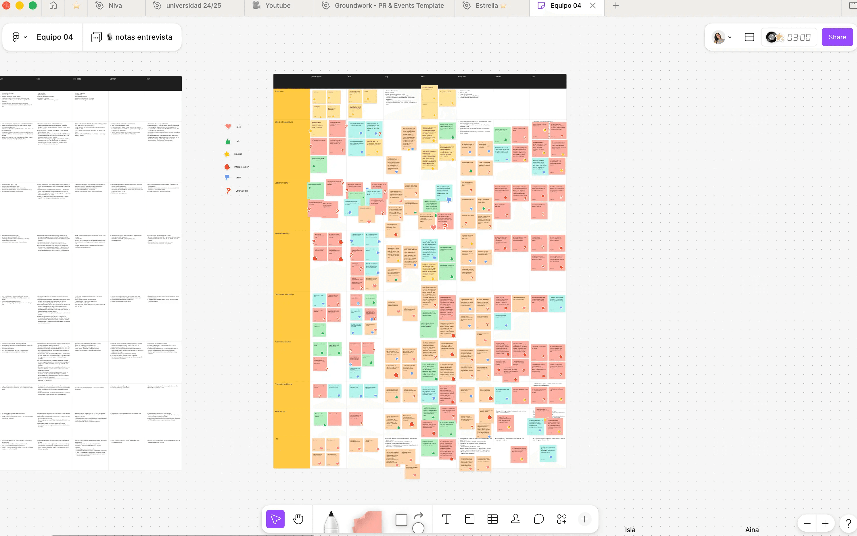
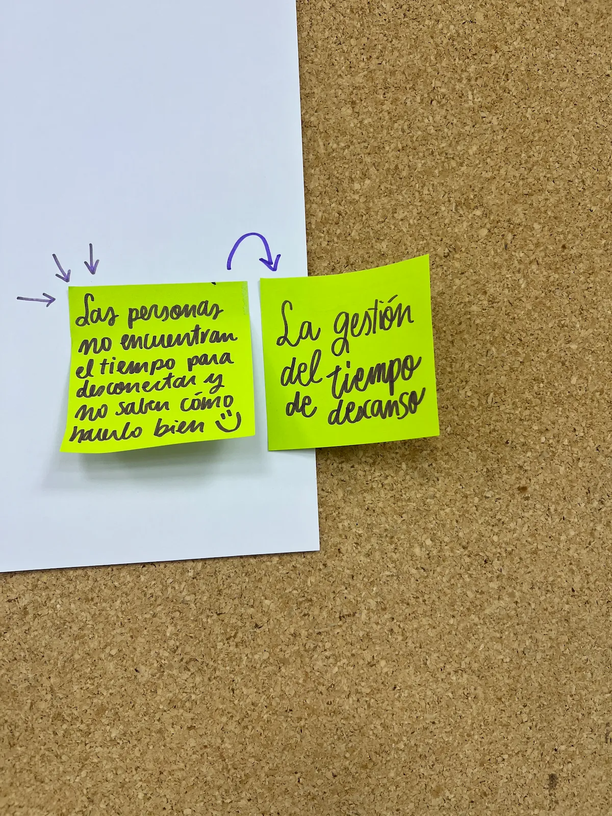

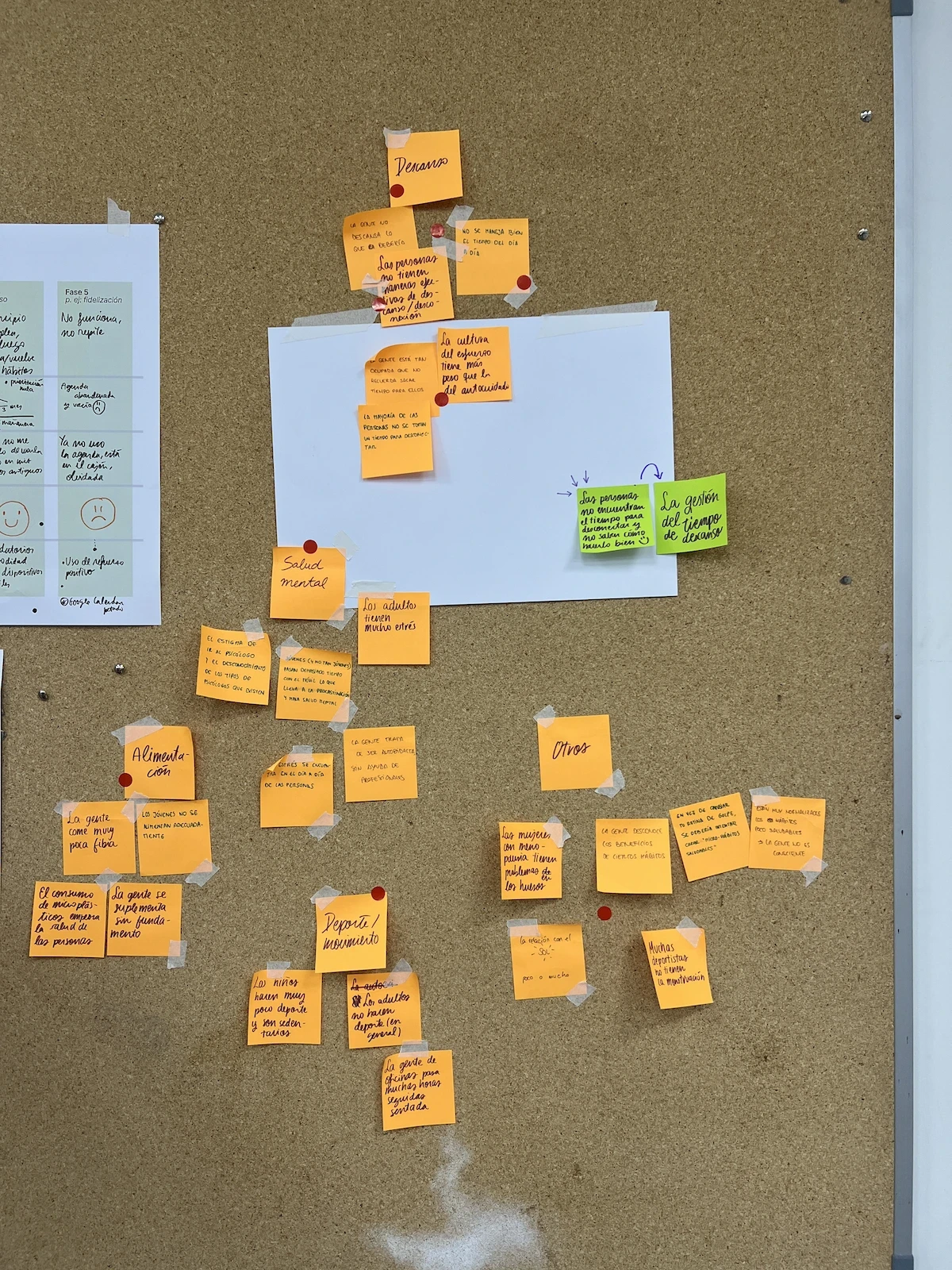

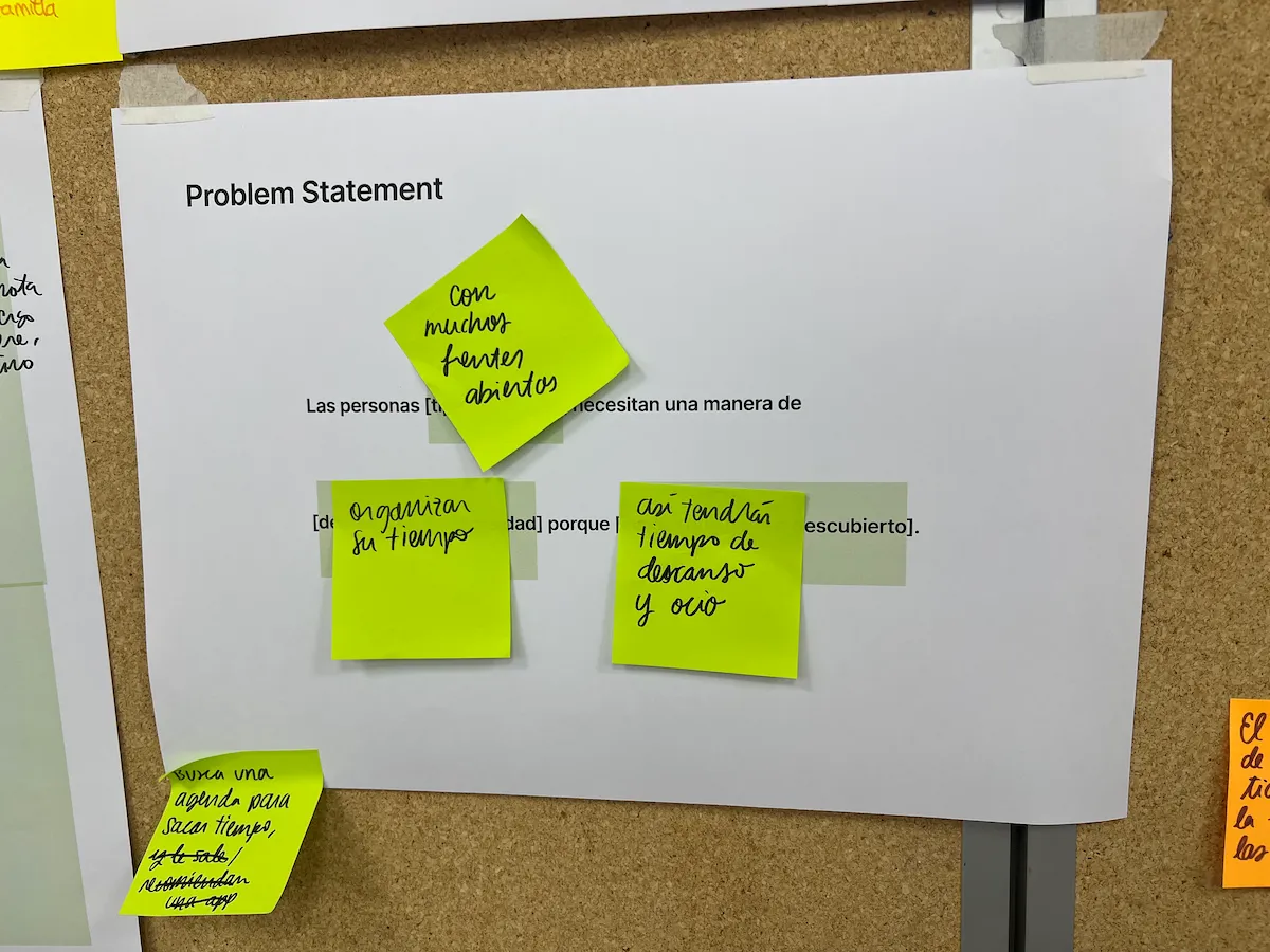
Some of our findings were expected, like the unequal task distributions or the impact that lack of rest was having on their mental health. Others, like their aversion to asking for help or the concept of invisible mental load, were not on our radar. Key in helping us better define the user needs.
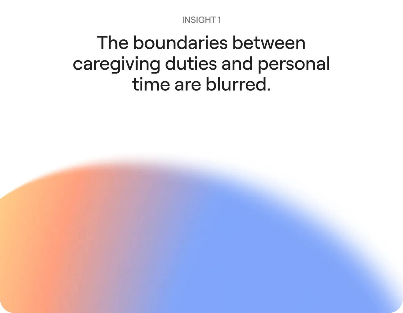


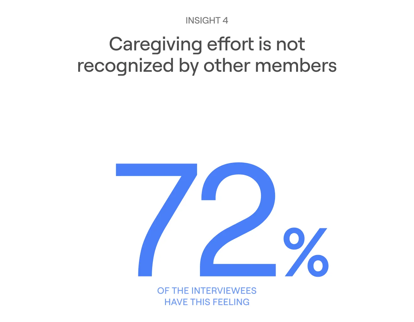
Drag me!
One thing that stuck with us from this whole process was how little time they had to actually do nothing outside of their usual schedule. Most of them had trouble in finding a spare hour for the interview. The research process itself became a reflection of the problem we were trying to solve.
How might we help adults caring for both children and aging parents offload the mental load of coordination so they can rest without planning first?
Our initial idea gravitated towards creating a tool where family members would distribute their housework. However, we realized it was not the best idea for two reasons:
Such busy people do not have the time to sit in front of a screen to decide who should water the plants or pick up the kids on Tuesday.
They were not rational when it came to distributing tasks, but rather split them the way they always had. Women ended up bearing most of the caregiving and household responsibilities.
What designing for busy users really mean
With that in mind and many iterations of new ways to think about how this could work, we stumbled upon one of our major findings: the onboarding.
In the best case scenario, our user would enter their whole life details in these first steps, letting the app handle the rest. But what if, instead of filling in one of those endless forms, they just talked and told Niva everything?


We did two rounds of user testing throughout the process, using Maze as an unmoderated testing tool, and then a moderated user test with the working prototype and real participants.
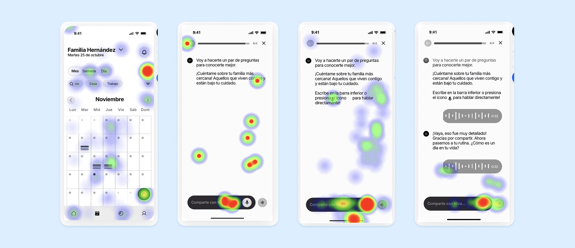
After validation, the rest of the product was defined by this idea of how we could use AI to help our users rest more. Delegation was one of the biggest barriers, solved through an intelligent agent that distributes tasks rationally. No manual work needed.
The app was conceived as an MVP, with just the core screens:

The talking onboarding flow. that reduces adoption time to the platform

The home page, which is a mixture of a conversational AI chat and a list of upcoming events
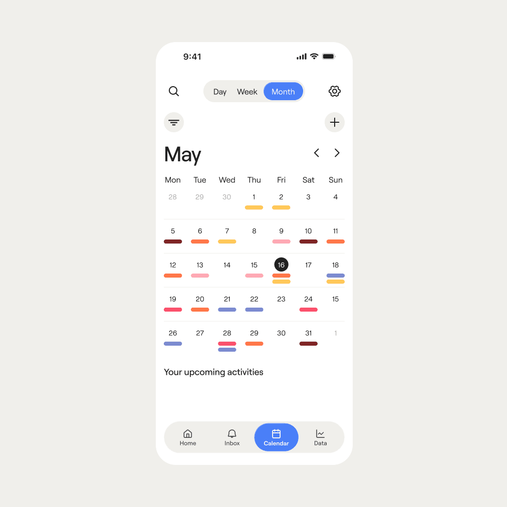
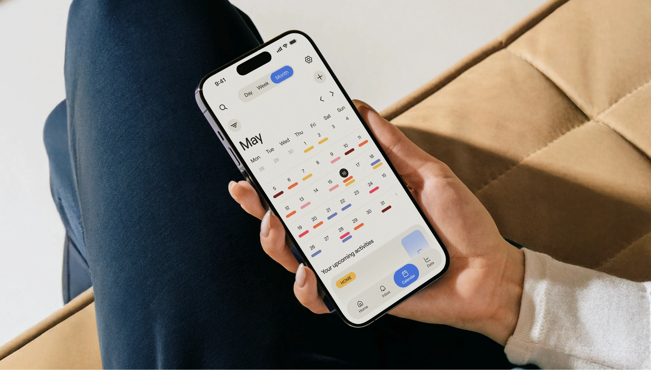
The calendar, to offer a bird's-eye view of the whole month ahead

An insights panel, so the user is always in control of the metrics and data the AI is using, and can look forward to their weekly and monthly family recaps
In terms of visual identity, we had the challenge to avoid looking too simple. Too gradient-heavy. Or too machine-like. This was back in November 2025, when Google icons were still flat and not all AI logos looked like ****holes. Our design principles gravitated around human touch, warmth and being welcoming and trustworthy to our middle-age public.
Decisions like the color palette (incredibly warm but with just the right touches of blue) the typography (with humanistic inspiration but technical details) and the grainy effect of the visuals were all small pieces that ended up making Niva look cohesive across the UI.

When the UX and the UI blend seamlessly
All design decisions were guided by our Design Principles. From UX to brand or motion, these ideas shaped the final look&feel of Niva:
The result is a cohesive interface that seeks to make something as complex as caring for others simple. This way, rest and fun can finally happen. Fewer choices, more clarity. No guilt.



Findings and learnings
The User Experience and Interface that resulted from this collaborative work are two things we are really proud of as a team. We learnt a lot about really owning a product from start to end in a very short period of time.
I think we could have improved the end result by doing more user research during a more extended period of time. The timings of the diploma this project was deloped at were really tight, so we did what we could with what we had 🤷♀️, but some hypotesis were not fully contrastadas because of the size of the sample.
Writing this in July 2026, in the midst of the AI boom (or bubble?), it seems like we just jumped on a trend. But, as a UX team, we really thought of ways to integrate technology in the life of very busy people so that an impartial being could divide work equally, give more importance to rest and, strategically, help with the gender gap in caring.
Talking of team, this project help me find out more about myself and the roles I play in teams. After 4 years in university working with more or less the same people, I found myself in the challenge of finding my own voice in a group again. Unsurprisingly, I found myself coordinating, which is a role I enjoy doing on top designing.
As an end note after this long (but I hope not wordy) case study, I think that the result is very solid for a first end-to-end product project. Was the ambient ideal because we were in an academic environment? Absolutely, but we tried to make it as real as possible, had lots of fun and learnt a lot along the way (which is always the main goal! isn’t it?)
Any questions? Drop me a word in an email or send me DM! Love discussing design


Team Niva!